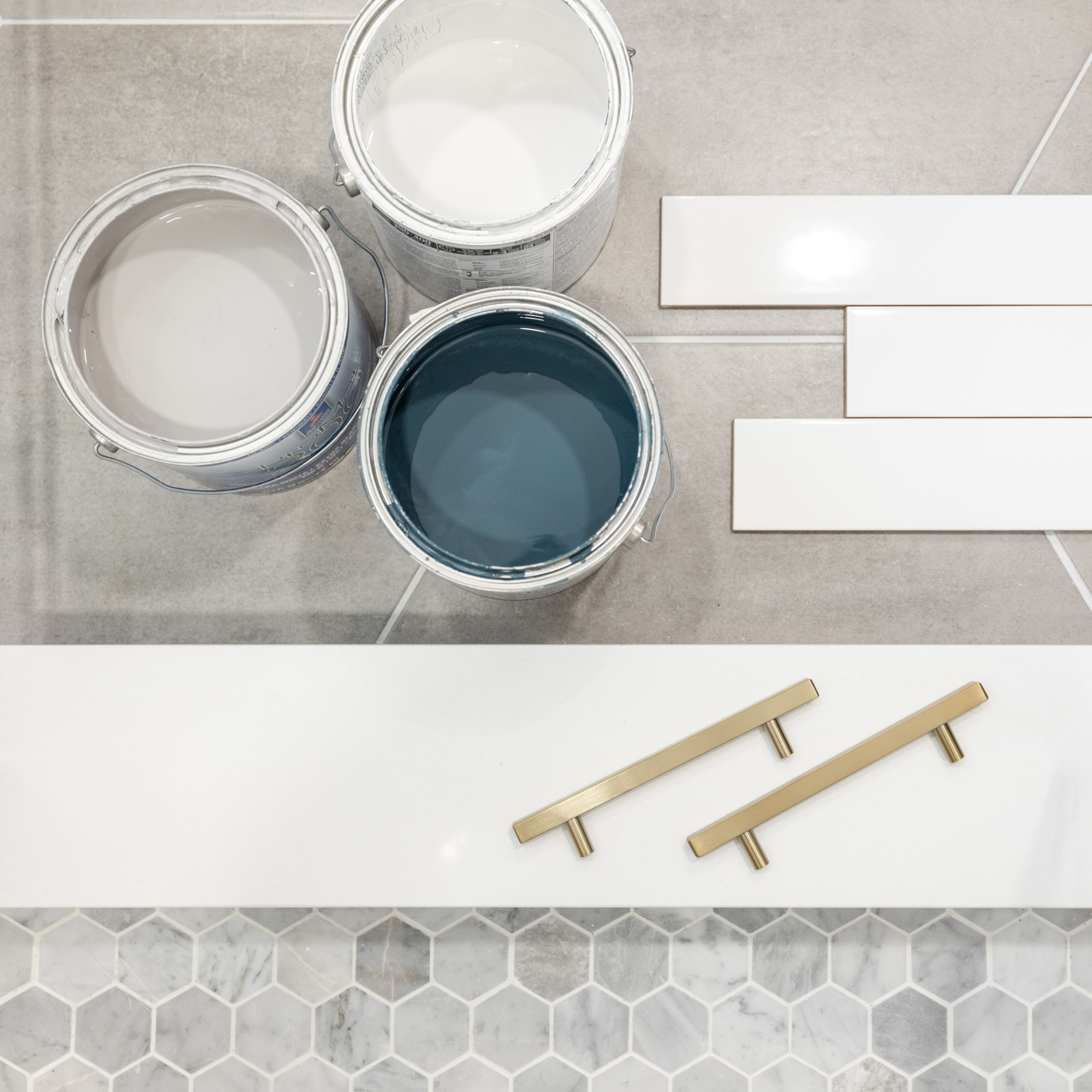
I’m going to share with you a not-so-secret tip that every home improvement lover already knows: the easiest, cheapest and most powerful way to transform anything inside or outside your home is PAINT. The perfect shade will utterly elevate your space. And conversely, choosing the wrong shade will will defeat any beautiful design. Are you thinking about adding some new life to dull walls, but can’t find the perfect hue? I’ve got you covered.
Snowbound
White is such a popular choice, but I frequently see it used incorrectly. The result of picking the wrong white can be jarring and cold. “Snowbound” by Sherwin Williams is my go-to for the perfect white paint, but it has just a hint of warmth that glows with softness. I use it all the time, and it’s ideal for that fresh, crisp look that everyone wants right now.

Shiplap
Crowd favorite “Shiplap” by Magnolia Home is a classic paint choice to highlight trim. It’s reminiscent of khaki with yellow undertones. It translates as a great pale yellow and my clients appreciate it for its subtlety. I would recommend it for your wood paneling, bead board, board and batten and woodwork details (Not sure which sheen to choose? See my Paint Sheen Guide here).

Americana Egg
“Americana Egg” by Magnolia Home is that perfect shade of sage green. My client actually chose this paint, and I couldn’t help but fall in love with it. We originally wanted to install classic black and white floor tile but changed to brick at the last minute. All of the warm red, pink and beige paired beautifully with it. We added rattan roller shades as a rich, textural element next to this complex green.

Aegean Teal
Yes girl, teal- but better! I’ve paired “Aegean Teal” by Benjamin Moore frequently with our local, beloved Austin Stone. You will find this mined right here in the quarries of Texas. It’s a little yellow, a little white with elements of cream and beige. Aegean Teal brings the drama and also looks fantastic next to your stainless steel appliances.

Repose Gray & Agreeable Gray
We’re still using gray paint! But the application has varied. I typically use these grays on cabinetry but sometimes on walls. “Repose Gray”, “Worldly Gray” and “Agreeable Gray” from Sherwin Williams pair well with Snowbound and it really brings out the veining in marble.


Peach Fuzz & Abalone Shell
I recently did a chiropractor’s office in a paint color called “Abalone Shell” by Sherwin Williams in the offices and “Peach Fuzz” by Sherwin Williams in the lobby. This was for an office centered around children. We wanted something playful and I think we captured that spirit well with these friendly pink tones. Think Parisian Pink, alongside navy and teal. Initially, we tried Cockleshell Pink and it looked just like Pepto Bismol! So we quickly replaced it with something more sophisticated but still in the pink family. When we put this on the wall, it looked so soft and sumptuous- just like crushed velvet. It’s a great neutral and I love that it’s also a little bit unexpected. Give it a try!


Your Summer Paint Guide
There you have it, folks. Hope you’ll keep these in your pocket and find them helpful in your next project!
So, what do you think? Have you tried any of these paint shades in YOUR home? I would love to see what you’ve done in your own interiors and hear your thoughts. Tell me your favorite paint shade in the comments!
Until next time,

